You’ve got traffic coming to your website. People are clicking, scrolling, maybe even poking around a few pages. But then… nothing. No form submissions. No purchases. No phone calls.
Sound familiar?
Here’s the thing, getting visitors to your site is only half the battle. The real magic happens when those visitors actually do something, whether that’s booking a consultation, signing up for your newsletter, or buying your product. That’s what we call conversion.
And if your website isn’t converting the way you’d hoped, you’re not alone. The good news? You don’t need a complete website overhaul to turn things around. Sometimes it’s the small, simple tweaks that make the biggest difference.
Let’s dive into five easy fixes that can start boosting your conversions right away.
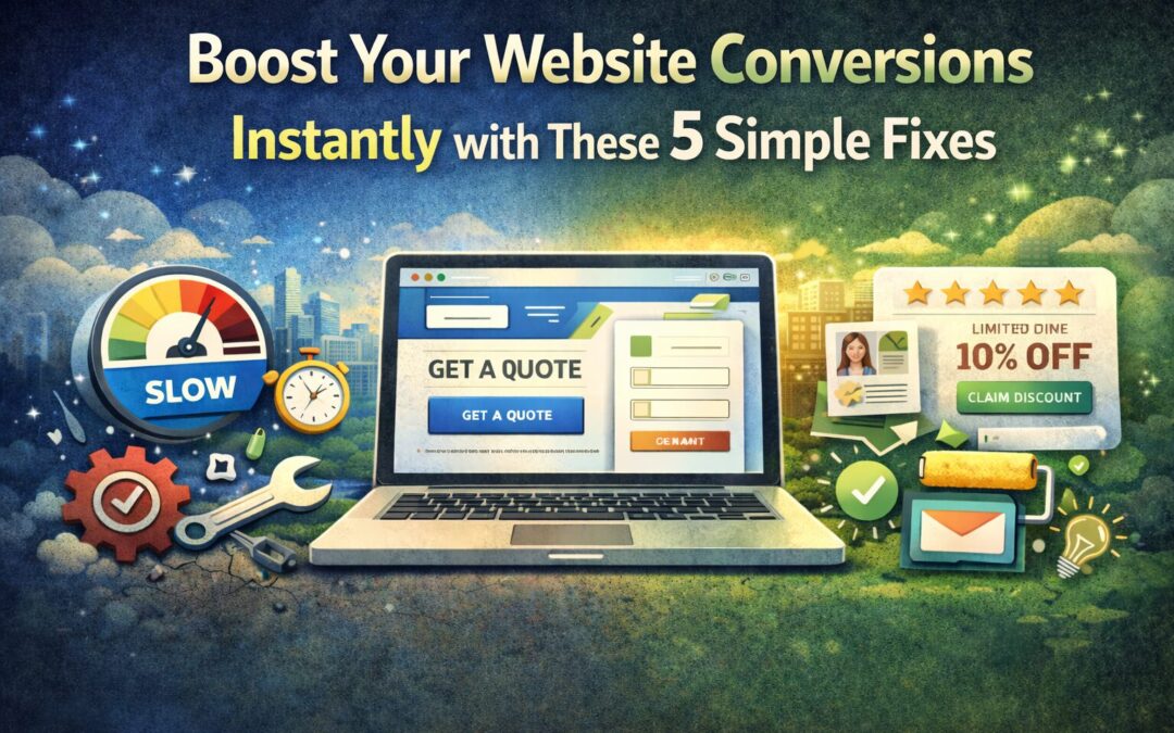
1. Speed Up Your Website (Because Nobody Waits Anymore)
Let’s be real, we live in a world of instant gratification. If your website takes more than a few seconds to load, visitors are already reaching for that back button.
Here’s a stat that might make you cringe: even a one-second delay in page load time can cause a 7% drop in conversions. Yikes.
Think about it from your customer’s perspective. They searched for something, clicked on your site, and now they’re staring at a loading spinner. That’s not exactly the first impression you want to make.
How to Fix It:
- Test your speed first. Tools like Google PageSpeed Insights or GTmetrix will show you exactly where your site is lagging.
- Compress your images. Those beautiful high-res photos might be gorgeous, but they could be slowing everything down. Use tools like TinyPNG or ShortPixel to shrink file sizes without losing quality.
- Clean up your plugins. If you’re running WordPress, too many plugins (or outdated ones) can bog down your site.
- Consider your hosting. Cheap hosting often means slow servers. It might be time to upgrade.
Speed isn’t just about user experience, it also affects your SEO. Google considers page speed when ranking websites, so faster sites get a little extra love in search results too.
2. Make Your Calls-to-Action Crystal Clear
Here’s a question, when someone lands on your website, do they know exactly what you want them to do next?
If your call-to-action (CTA) is buried at the bottom of the page, uses vague language like “Submit” or “Click Here,” or blends into the background like it’s playing hide-and-seek… you’ve got a problem.
Your CTA is the moment of truth. It’s where a casual browser becomes a potential customer. So it needs to stand out and tell people exactly what they’re getting.
How to Fix It:
- Use action-oriented language. Instead of “Submit,” try something specific like “Get Your Free Quote” or “Start My Free Trial.” Tell them exactly what happens when they click.
- Make it visually pop. Your CTA button should contrast with the rest of your page. If your site is mostly blue, try an orange or green button.
- Put it where people can see it. Don’t make visitors scroll forever to find your CTA. Include one above the fold (the part of your site visible without scrolling) and repeat it throughout the page.
- Keep it simple. One primary CTA per page is usually best. Too many options can paralyze people.
A/B testing can be incredibly helpful here. Try different button colors, wording, or placements and see what resonates with your audience. You might be surprised how much a small change can move the needle.
3. Simplify Your Forms (Less Is Definitely More)
Nobody, and I mean nobody, wants to fill out a 15-field form just to get a quote or sign up for an email list.
Every extra field you add is another opportunity for someone to abandon ship. People are busy, they’re distracted, and they’re probably filling out your form on their phone while waiting in line for coffee. Make it easy for them.
How to Fix It:
- Ask only for what you truly need. Do you really need their phone number, company size, and mailing address right now? Probably not. Name and email are often enough to start a conversation.
- Try multi-step forms. Breaking a longer form into smaller chunks (with a progress bar) feels less overwhelming than one giant wall of fields.
- Use auto-fill when possible. Let browsers do some of the heavy lifting.
- Label everything clearly. If someone has to guess what goes in a field, you’ve already lost them.
If you’re running an e-commerce site, consider offering guest checkout. Forcing people to create an account before purchasing is one of the top reasons for cart abandonment. Let them buy first, then invite them to create an account after.
4. Show Off Your Social Proof
Here’s a little secret about human psychology, we’re heavily influenced by what other people do. It’s called social proof, and it’s incredibly powerful.
When potential customers see that other people have had great experiences with your business, they’re way more likely to trust you. Reviews, testimonials, case studies, they all signal that you’re the real deal.
How to Fix It:
- Add customer testimonials to key pages. Your homepage, services pages, and anywhere someone might be making a decision are prime real estate.
- Display star ratings and reviews. If you’ve got great Google reviews or feedback from past clients, show them off!
- Include real names and photos when possible. A testimonial from “Sarah M., Denver CO” with a headshot feels way more credible than “Happy Customer.”
- Highlight numbers that impress. “500+ projects completed” or “Trusted by 1,000+ small businesses” can boost confidence instantly.
- Encourage user-generated content. If customers share photos or stories about your product, ask if you can feature them.
Don’t have a lot of reviews yet? Start asking! Most happy customers are willing to leave a review, they just need a little nudge.
5. Catch Visitors Before They Leave with Exit-Intent Popups
Okay, hear me out. I know popups can be annoying when done wrong. But exit-intent popups, the ones that appear when someone is about to leave your site, can be surprisingly effective when used thoughtfully.
Think of it as your last chance to make an offer before someone walks out the door.
How to Fix It:
- Offer something valuable. A discount code, free shipping, a downloadable guide, or a free consultation can be enough to make someone pause.
- Keep it simple and focused. One offer, one clear CTA. Don’t overwhelm them with information.
- Make it easy to close. Nothing frustrates visitors more than a popup they can’t dismiss. A clear “X” or “No thanks” option is essential.
- Don’t overdo it. One exit popup per visit is plenty. You don’t want to feel desperate.
Exit popups work especially well for e-commerce sites (hello, abandoned cart recovery!) but they can be effective for service-based businesses too. Offering a free resource or consultation can capture leads who might otherwise disappear forever.
Ready to Start Converting?
The best part about these five fixes? None of them require a massive budget or months of development time. They’re simple, actionable tweaks that can start making a difference right away.
Start with one, maybe your page speed or your CTAs, and see what happens. Then move on to the next. Small improvements add up quickly.
And if you’re feeling overwhelmed or want a professional eye on your website, we’d love to help. At Echo & Ether, we specialize in building websites that don’t just look great, they actually work for your business.
Here’s to more clicks, more conversions, and more customers. You’ve got this!